
SEPTEMBER 16, 2014 • UNCATEGORIZED • BY OMEGA DESIGN GROUP
How an architect draws can tell you many things – you can often tell the priorities of a firm just by looking at the quality of their drawings. Forget the content for now – and this isn’t just semantics – it’s the quality speaks to the culture of the firm. For the purposes of this writing, I am going to assume that all architectural drawings are correct and serve the purpose of conveying intent, scope and quantity.
But that’s not really the whole story, is it?
When Mr. Quick and I started drafting in 19(mumble, mumble), CAD programs were non-existent. Computers were pretty rare for that matter. All firms were still drawing by hand.
This was where we really learned how to draw, but before you ol’ timers say, “that’s right!” and you younger whipper-snappers look at this as “give me a break”, I’m not saying we drew better, I’m just saying it was different. We used 3 or 4 different lead holders with leads of varying degrees of hard/soft to them. We made thoughtful efforts to add profile lines, hatching, foreground, and background indicators. We unnecessarily used sky, flora and fauna, and shading to make our drawings “read” better. You could look at the hand drawings and frequently tell who had drawn that sheet or that detail. It was art to me (even though we now have a saying in this office: Stop! It’s not art!) I thought these drawings were beautiful and I didn’t like it when it became necessary for someone to finish up my drawing (other than Mr. Q). Adding their sloppy pencil work to the magic I had created.
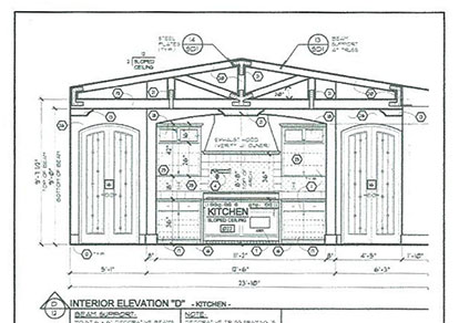
It was a big deal to me years ago and, even though we don’t draw by hand anymore, it’s still a big deal to me. Graphic standards from “out of the box” CAD programs are OK. Not great. Maybe not even good. One has to make changes and adjustments to make the drawing pop! To read easily and to be consistent. I make these changes because I make it a point to care about how our work is perceived by the people who build from them. Not only do properly delineated drawings read better, they convey a sense of what it took to create them.
We review our drawings page by page, detail by detail and ask ourselves; does the drawing convey the information we are striving for… Do they look hand drawn? Of course not, but that’s the graphic bar we are striving for: line weights, depths of field and clarity –
Does it make sense?
Is it intuitive?
Can you tell what’s being cut through?
What’s closer or further away?
Can you tell a section line from a center line?
Is this a setback line or a property line?
The list is infinite, and if you use what comes “right out of the box”, you might be factually correct but there’s no office culture conveyed in the drawings. It’s work; sometimes a giant pain, but it’s worth it. Every bit. Line weights fall into place, font sizes are hierarchically appropriate, the balance of light and dark coming into balance. The payoff of having the graphics and pen weights in balance is that you can incorporate much more information into a single drawing and have it remain legible.
After years and years of focused effort, our work looks like our work. Work that we are extremely proud of and that can be passed down to new hires who have the opportunity to take it to the next level of our office culture.
|